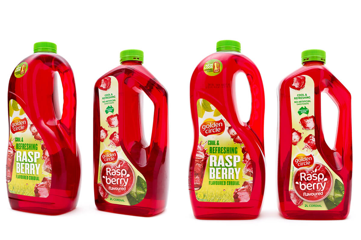
/colourful classic gets a makeover
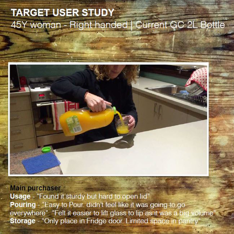
Heinz wanted to shift the perception of cordial being a kids drink, to something more for kids and adult enjoyment. In either case, there will be both adult and child interaction with the bottle, so from an ergonomic perspective, it was important to consider handling and pour control with small and large hands of varying strength. Being a concentrated product, it is important that a confident and controlled pour is achieved. We conducted basic trials to test and observe the consumer's journey with the bottle from shelf to fridge to pouring and onto storage. Observations at this level helped to benchmark functional performance of the current bottle and highlight areas of opportunity for improvement.
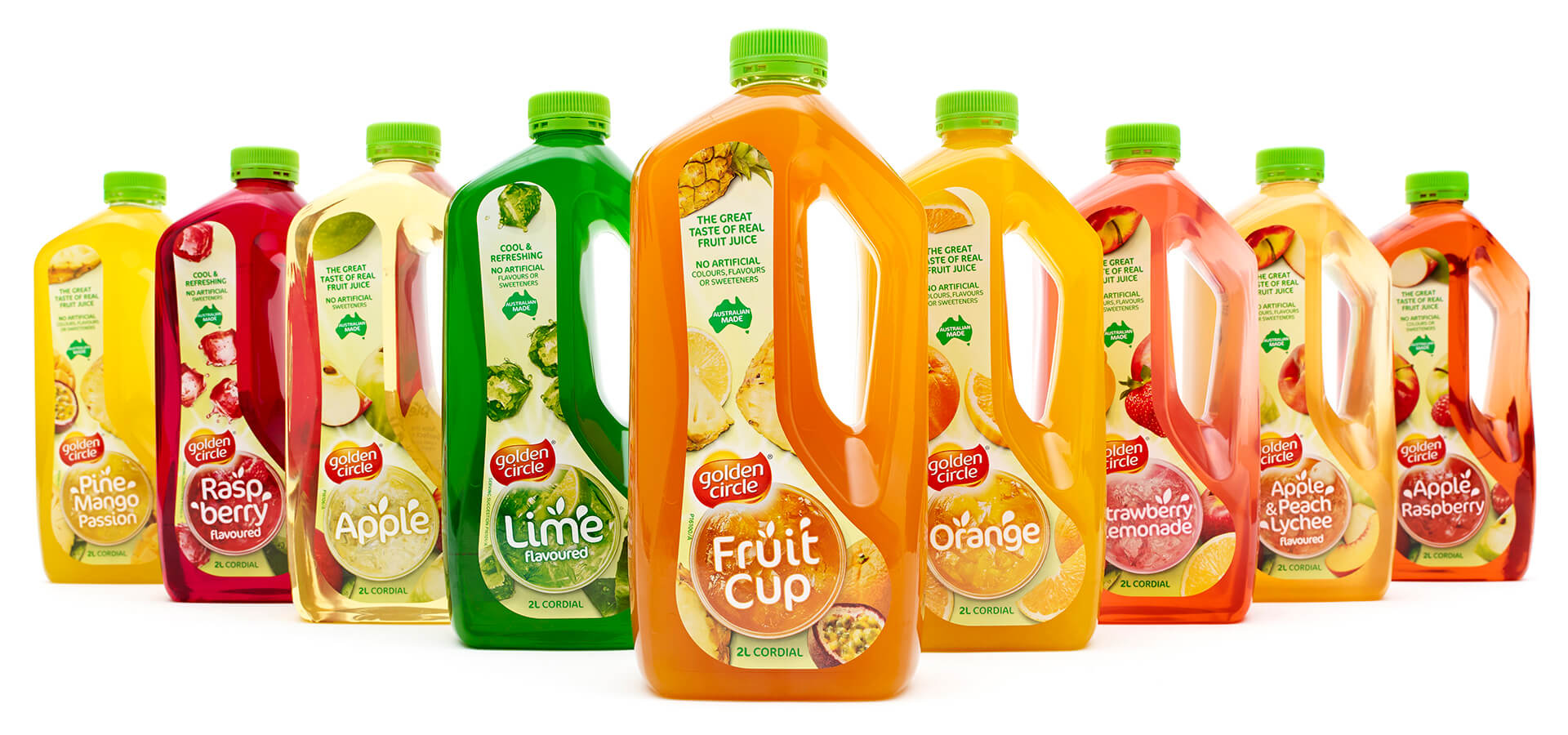
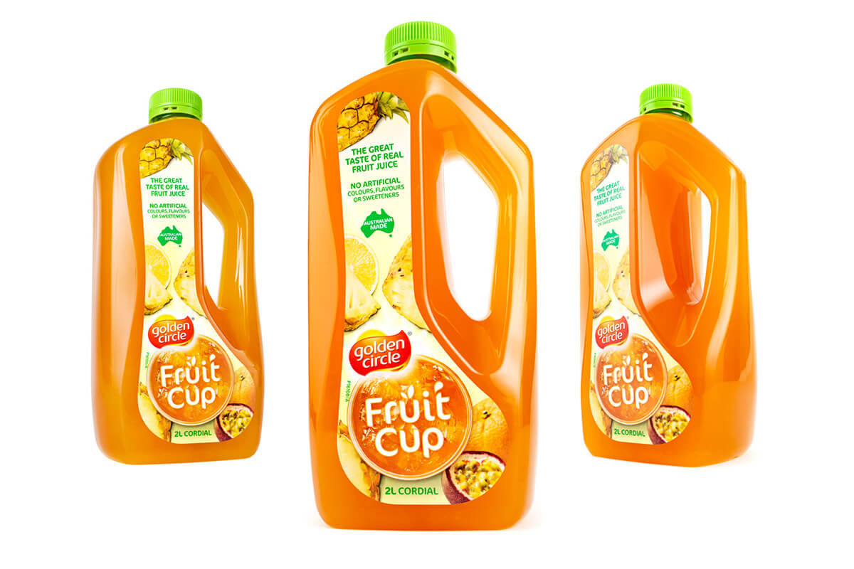
Aside from functional performance, this bottle also needed to deliver an invigorated aesthetic for the Golden Circle cordial brand. We created various aesthetic theme groups for creative design development in line with Heinz marketing objectives, including 'Crisp and Clean' and 'Fruit Inspired'. The carefully collated imagery within each of these themes was then used as the catalyst for bottle design forms and features and built around a focus on ergonomics.
.jpg)
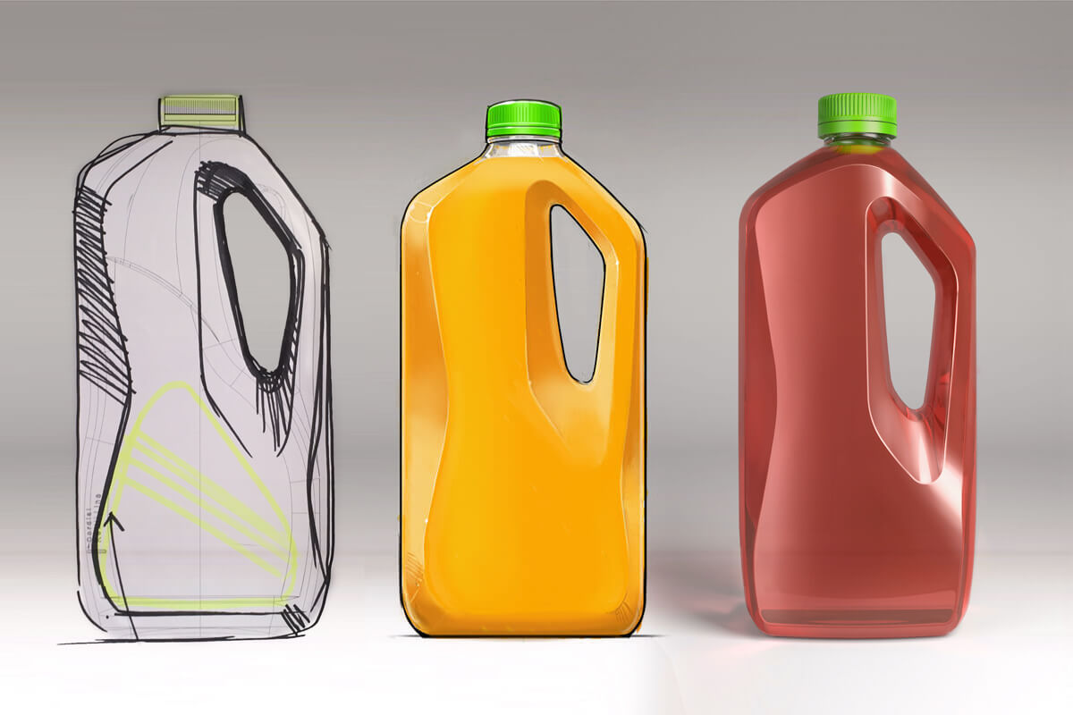
With design themes in place, we were able to run ideation sessions and explore a range of targeted aesthetic concepts for the bottle. Generating basic 3D computer models and using them as underlays for sketch work ensured that we were exploring design concepts in realistic 2L proportions and working within the correct parameters critical to ensure efficient line speed filling, labelling and packing efficiency. Key objectives for each concept sketch was the translation of the design theme, the point of sale and shelf blocking impact, and consideration of bottle handling and pouring. Numerous concepts were presented to Heinz in digital Wacom sketch format first, before culling to two favoured directions and further realising these forms in 3D CAD, then selecting the final concept direction for design detailing. The favoured concept came from the 'Crisp and Clean' theme set, and with its angular form and faceted highlights it pulls itself away from the softness of the original bottle and adds a touch of sophistication and refinement. A key aspect of the chosen design concept was the handle design and the functional inspiration it took from 1990's Kettle handle designs.
Improved balance.
The first noticeable difference from old to new was the lowering of the handle recess. This, in turn, lowered the centre point of gravity which improved the balance and comfort in hand. The lowered position also meant that when in the pouring position, predominantly horizontal, the bulk of the liquid sat directly under the handle improving control and balance to small hands.
Increased comfort.
During the user testing, we observed many "white knuckle" moments. This is a clear indicator of ill-suited width in the hand and can lead to “over-grip” when lifting to pour. This causes extra stress on the knuckles and grip area. By widening the width of the handle we provided a flatter panel to sit comfortably against the palm of the hand on the lift and pour. This also mimics the wider handles found on older Kettle designs that were aimed towards comfort rather than style.
Removal of the grip indents.
The previous bottle was designed by a toolmaker to suit the blowing process rather than the consumer. It was quite narrow, sharp at the split line and also incorporated deep indents. These indents serve no functional purpose other than providing pinch points to the user's hands under load. With the wider handle, the fingers are moved further apart and the smooth flatness of the handle spreads the load.
Anti-Glug and thumb support.
Often when pouring for the first time air entrapment can occur where the handle opening meets the neck finish of a bottle. When pouring, the entrapped air forces its way out rapidly, causing an overshoot. Using the experience our team gained from designing the Golden Circle Juice bottle’s centralised handled (2011), we again introduced a wide lead-in from the handle to the base of the neck finish. This area supported the pouring ergonomics as it provided ample real estate for the user's thumb to be placed when pouring with larger hands. This improved both balance and control.
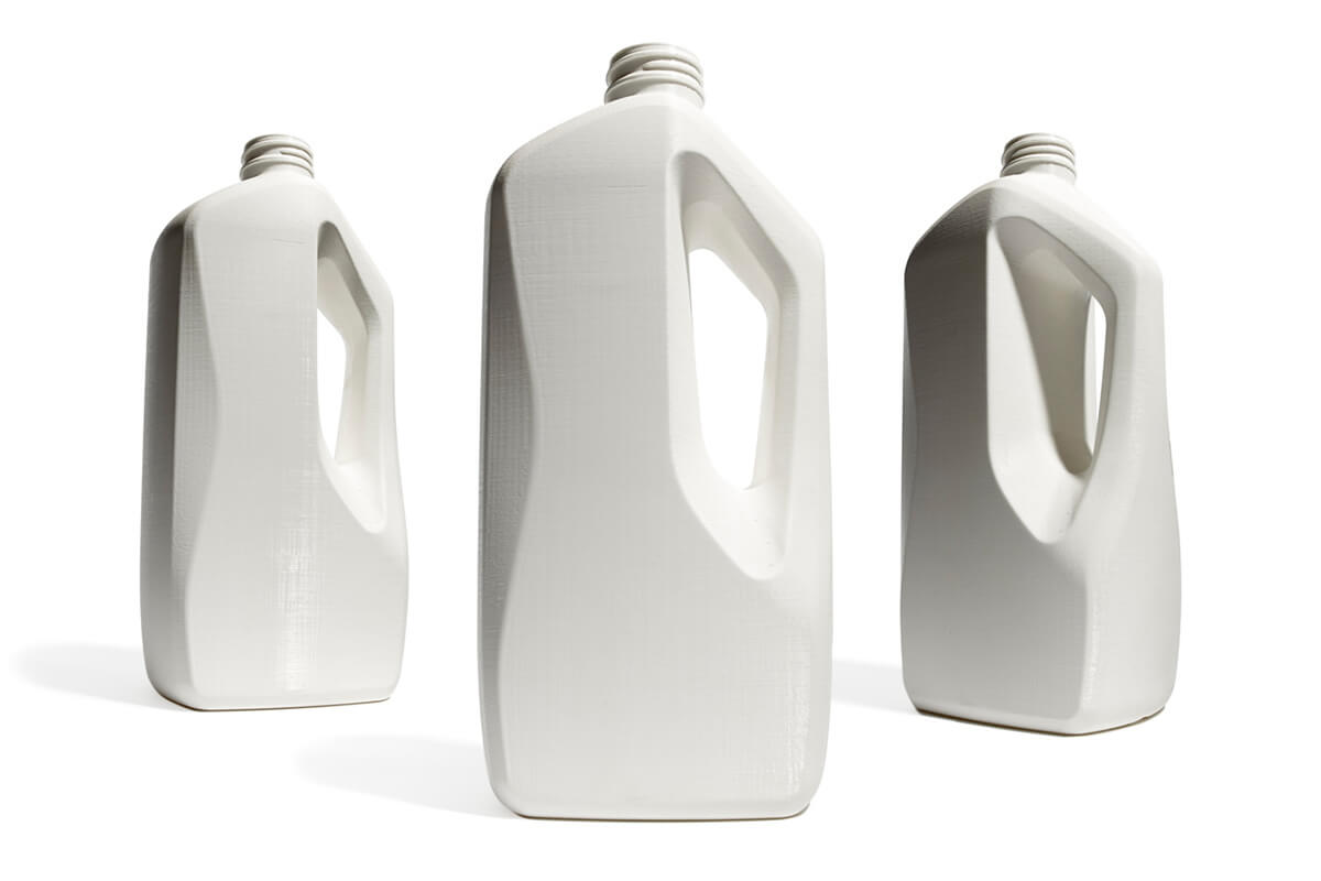
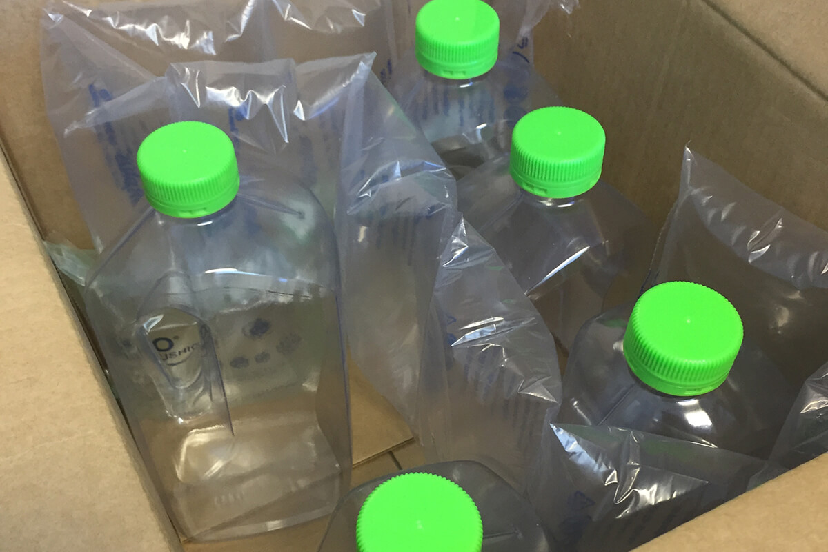
Physical prototypes of the bottle design allowed for an important tangible level of design review. These prototypes allowed us to trial and review feature size and impact, including the pouring handle size and position and general bottle proportion and appearance in comparison to the existing GC cordial bottle and immediate competitor products. Prototyping in an FDM process and material allowed us to fill the bottle and evaluate aspects such as comfort, balance and pouring control.
.jpg)
Post the Beta Prototype, detail CAD work was completed with some finesse of volume targets and refinement to meet moulding capabilities of the chosen supplier. This was to maintain the light weight and brimful targets given. Pre-commission samples were produced and run down the line for final finish of all change parts. The label die-line was adjusted to match the design aesthetic and adjusted to maximise the label line speed and sync the top and lower touch points.
The refreshed design of the Golden Circle Cordial bottle presented a visual shift on the shelf against the market leading Cottee’s brand. With its broader shoulders and flatter branding panel maximising its blocking ability and the size, location and angular shape of the handle, this evolution was in stark contrast to the previous design and the competitive set’s soft and bubbly style.
2017 - PIDA - Finalist | Food Catagory